Hapatune
Art Direction | Brand Design | Motion Design | UI/UX Design
About
Let's Talk
Art Direction | Brand Design | Motion Design | UI/UX Design
Hapatune is a marketing agency focused on supporting emerging and mid-sized bioprocess suppliers and life science innovators. Their team offers strategic marketing solutions tailored to the unique needs of the bioprocessing sector, including biologics, oligonucleotides, peptides, mRNA, and cell and gene therapies. Hapatune's mission is to level the playing field for underrepresented companies by providing deep industry expertise, creative storytelling, and analytics-driven strategies to enhance brand visibility and drive growth.
Problem
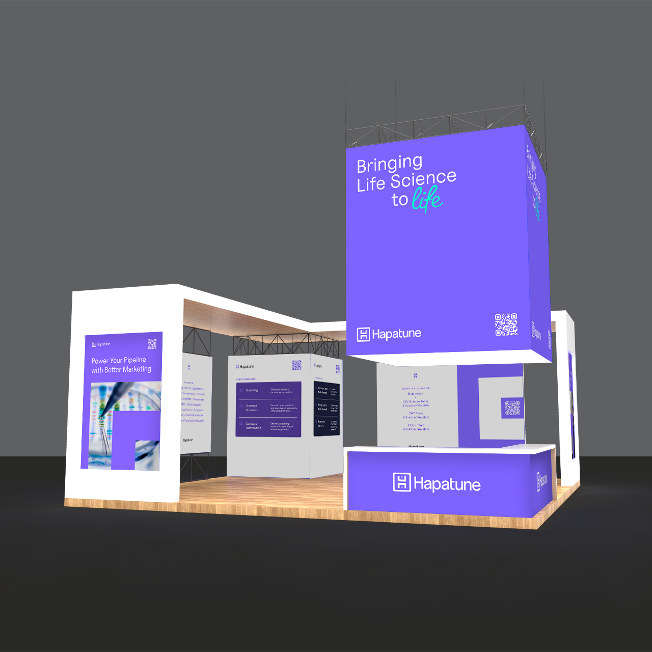
Hapatune needed a visual identity that matched the level of strategic and creative excellence they deliver to clients. Their existing brand felt outdated and didn’t reflect their focus on helping bioprocess companies grow or their increasing work with clients in Japan—where marketing tends to be more understated than in the U.S. or EU. They also needed a logo and system that could carry meaning, stand out, and scale with the brand.
Solution
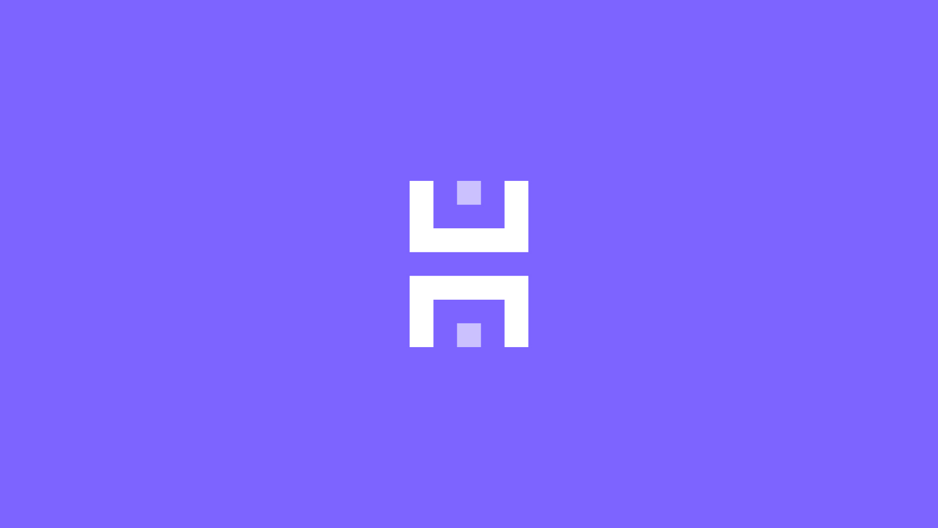
We developed a modern identity anchored by a new logo inspired by the Japanese character for "tree"—a symbol of growth and prosperity. The mark also forms an "H" and subtly nods to Hapatune’s Hawaiian roots with a Polynesian aesthetic. We retained their signature purple but refreshed it for vibrancy, and introduced a new accent color called “Olo”—a newly discovered hue that symbolizes scientific innovation and breakthrough thinking, just like Hapatune’s clients. A restrained secondary palette lets purple lead, while Olo adds a spark of energy. We also updated the typeface from Avenir to Uncut Sans, and built a whitespace-driven design system grounded in simple geometric shapes, creating a clean, modern feel across all brand touchpoints.
Results
While the full rebrand is still in the process of rolling out, early reactions have been overwhelmingly positive. Internally, the new identity has sparked renewed energy and alignment, helping the team feel proud of a brand that finally reflects the caliber of their work. Externally, clients have responded well to the visual balance of boldness and subtlety. The refreshed system is already proving adaptable across digital and print, setting a strong foundation for continued growth.
20%
increase in monthly website traffic since launch.